First Look: Harvey Nichols unveils tech-infused store
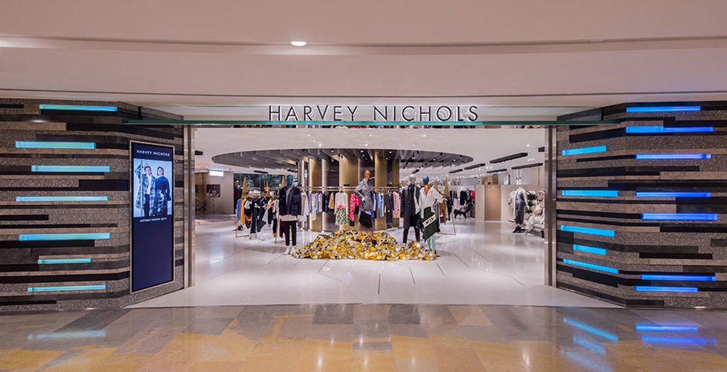
British luxury department store retailer Harvey Nichols’ revamped store in Hong Kong’s Pacific Place artfully blends interactive hi-tech elements with more traditional physical shopping experiences.
The two-story outpost has been consolidated into a single level, 42,000-sq.-ft. space as part of the redesign, which represents a new design concept by Studio Four IV. Although floor space has been halved, the new format uses technology to allow Harvey Nichols to expand its product offer and gives customers access to new experiences and services.
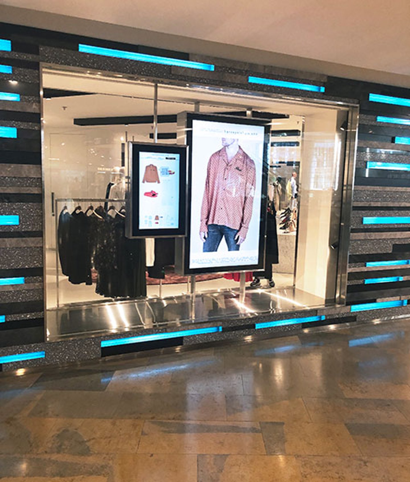
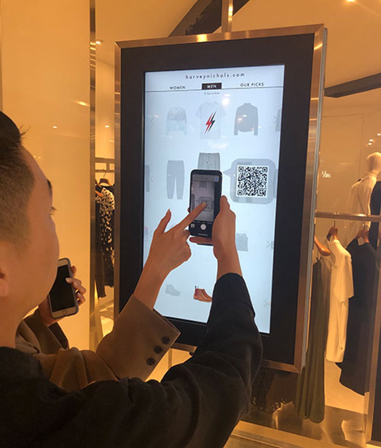
The experience starts on the exterior. The expansive storefront features a design of slivers of stone with lit glass rods, whose light gently pulses across the length of the store, hinting at the tech that visitors will experience inside. Interactive touchscreens in the windows spark interest as customers swipe through the options, scanning QR codes to download product details to ‘build their look’ inspired by the products displayed alongside.
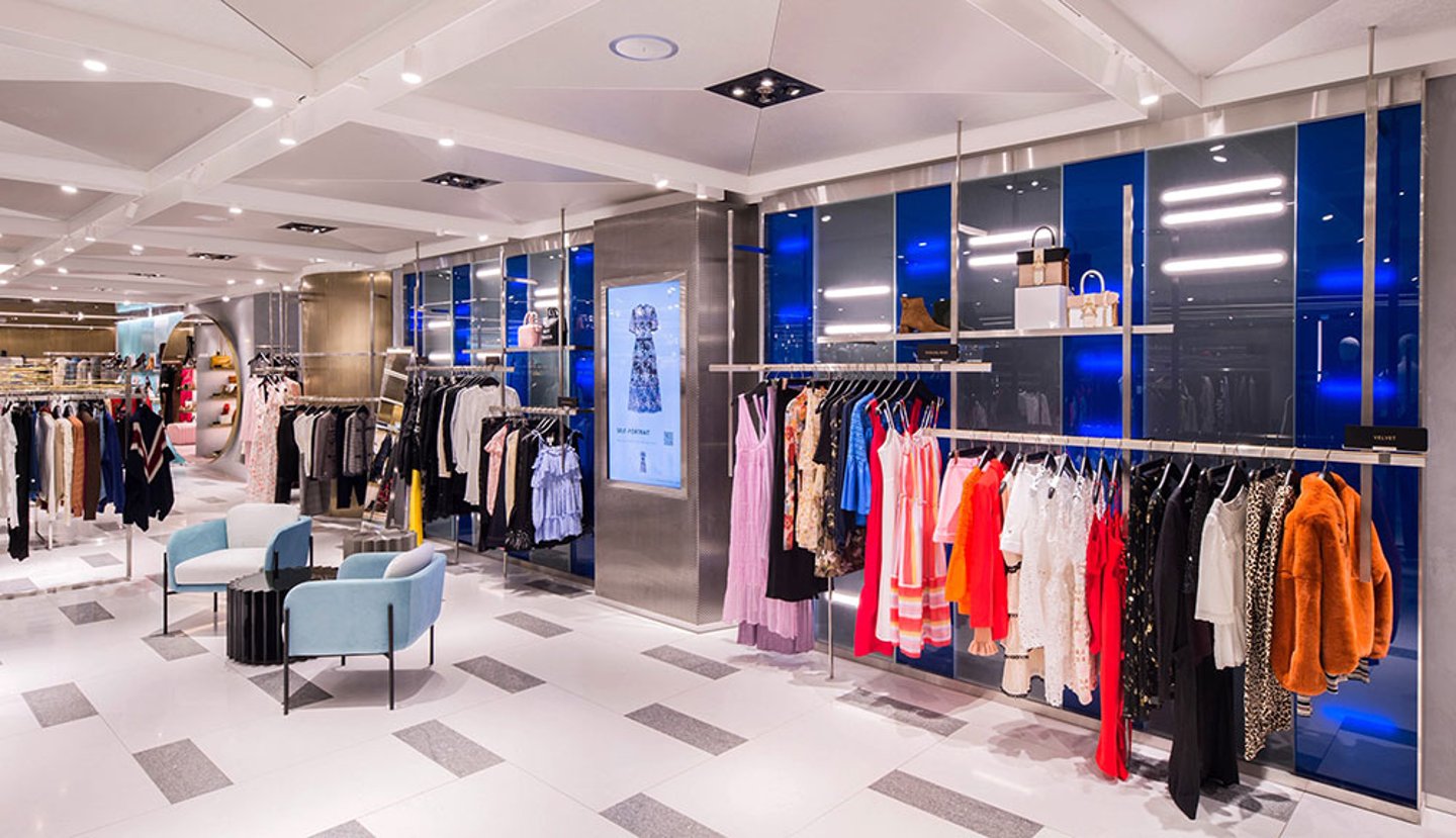
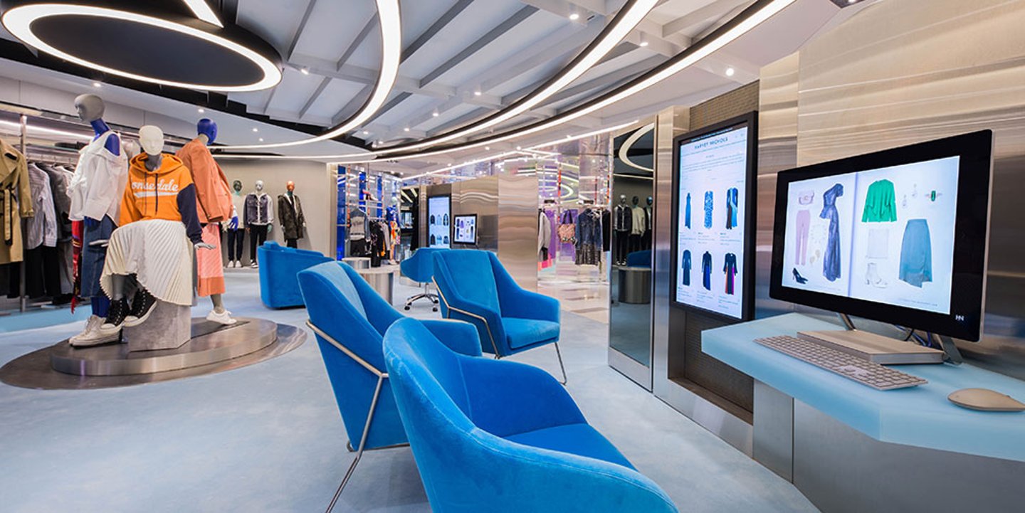
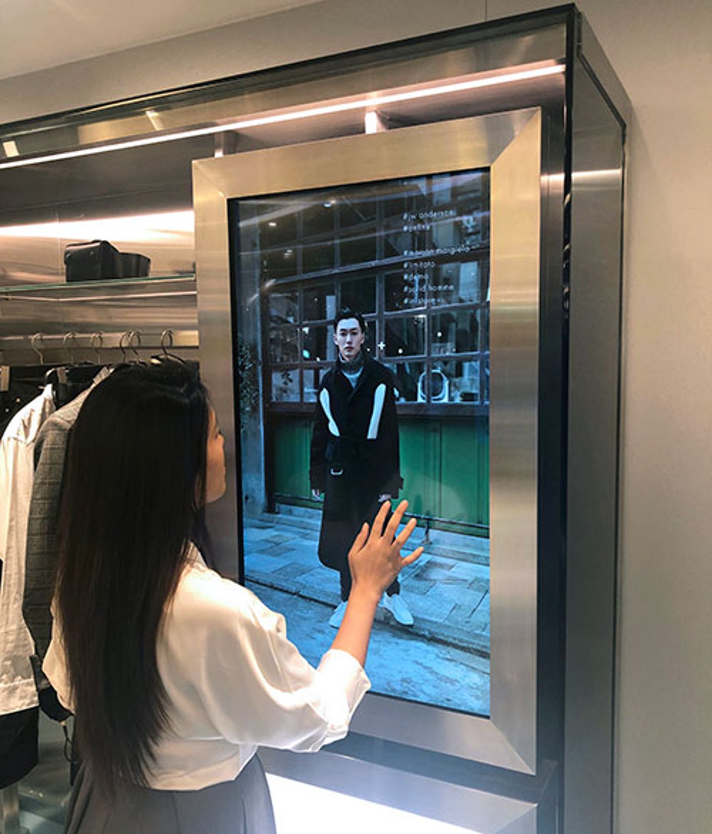
INTERIOR: Inside, technology advances the premise that the store is ‘bigger than its four walls.’ Customers can shop the store’s physical merchandise and also explore Harvey Nichols’ full online assortment via touchscreens that are interspersed throughout the space. When not in use by customers, the screens show content such as catwalk shows, editorial films and curated collections of garments and accessories that supplement the in-store edit.
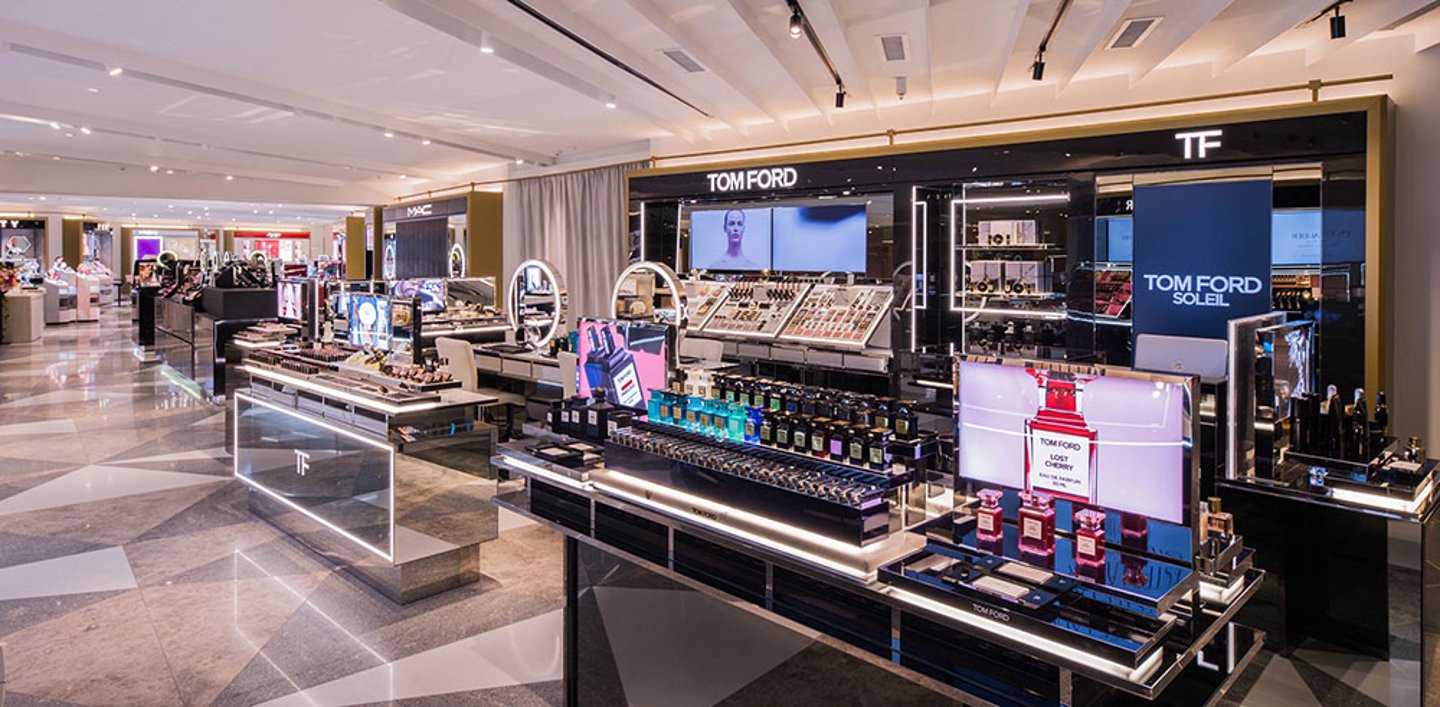
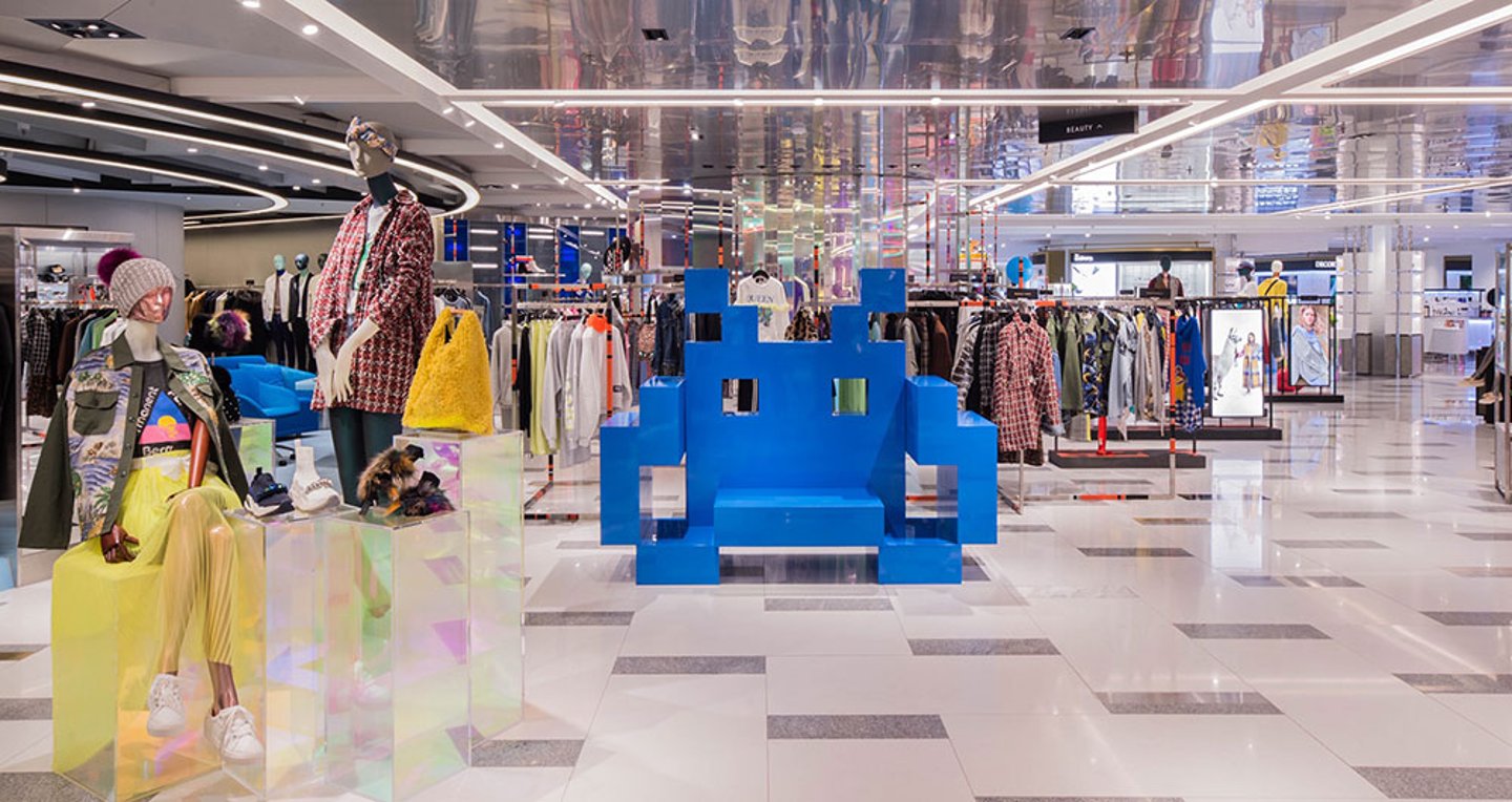
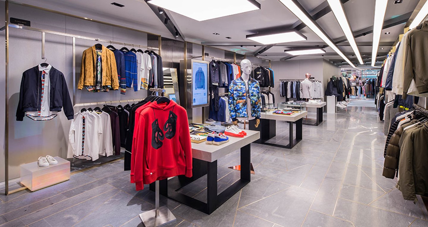
Open sightlines allow for good visibility throughout the space. Animated framed screens provide signposting, while pathways and lighting guide customers, helping them navigate the space with ease. Intricate details such as the design of the lighting framework overhead emulate computer circuit-boards, providing a further nod to the tech-infused store concept.
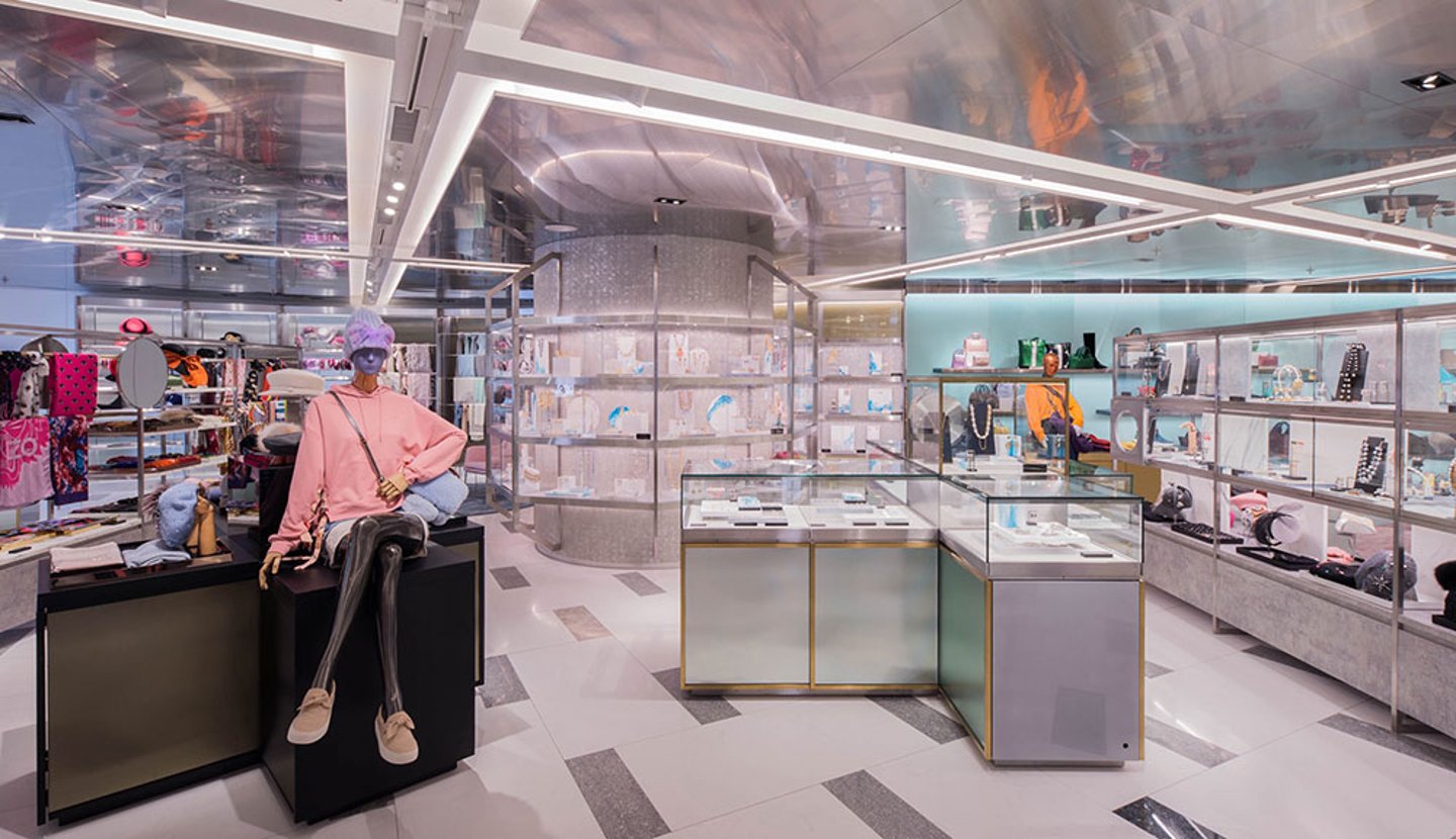
While Harvey Nichols online focuses on stocking major international brands, the physical space is more focused on showcasing newness and emerging labels. This gives customers the opportunity to see, touch and feel the product, building appreciation for a new designer, which is something they are more likely to do through the physical rather than a virtual experience.
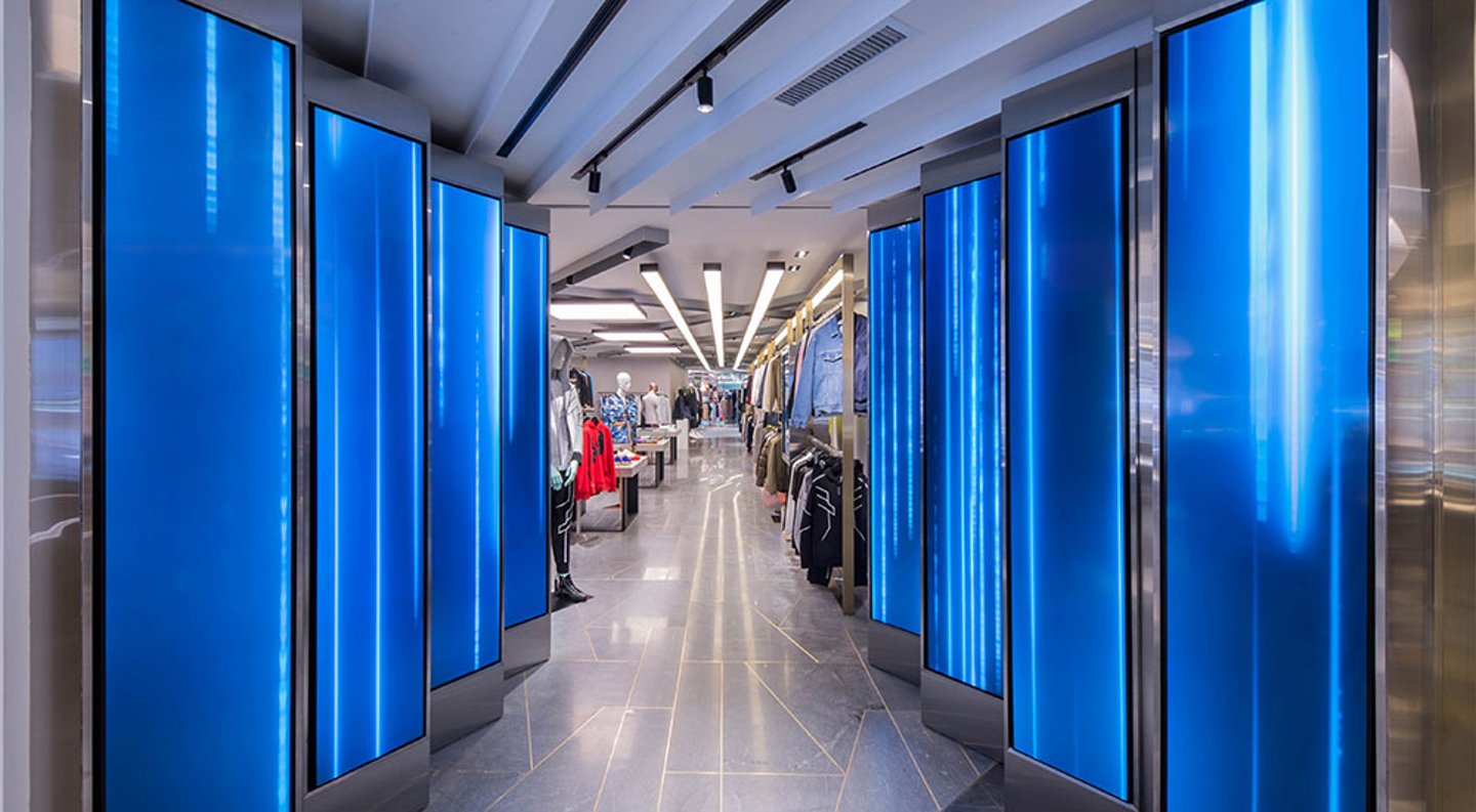
With the reduction in space, the revamped store features a smaller assortment of menswear. A digital waterfall feature highlights the entrance for menswear, which is presented in ‘e-tunnel’, which as the name suggests, is a more intense digital experience, where greater emphasis is place on customers browsing collections via the touchscreens.
In the center of the store, the ready-to-wear department wraps round an interactive lounge where customers can browse Harvey Nichols website in a more relaxed environment. Harvey Nichols’ dedicated team of stylists are available for consultations and to help with product recommendations to create a look book based on the customer’s personal style, needs and preferences. Customers can then order products to collect in-store or have them delivered to their home or office.
The generous fitting rooms feature lighting that can be adjusted to suit the outfit, occasion and customer. The concept also accommodates more discrete spaces, where stylists can look after VIP clients with greater privacy. A spacious luxurious personal shopping suite, equipped with a vanity room, provides guests with a true sense of comfort and indulgence.


