Check out KFC’s first drive-thru only location
KFC is piloting a new, tech-enhanced format.
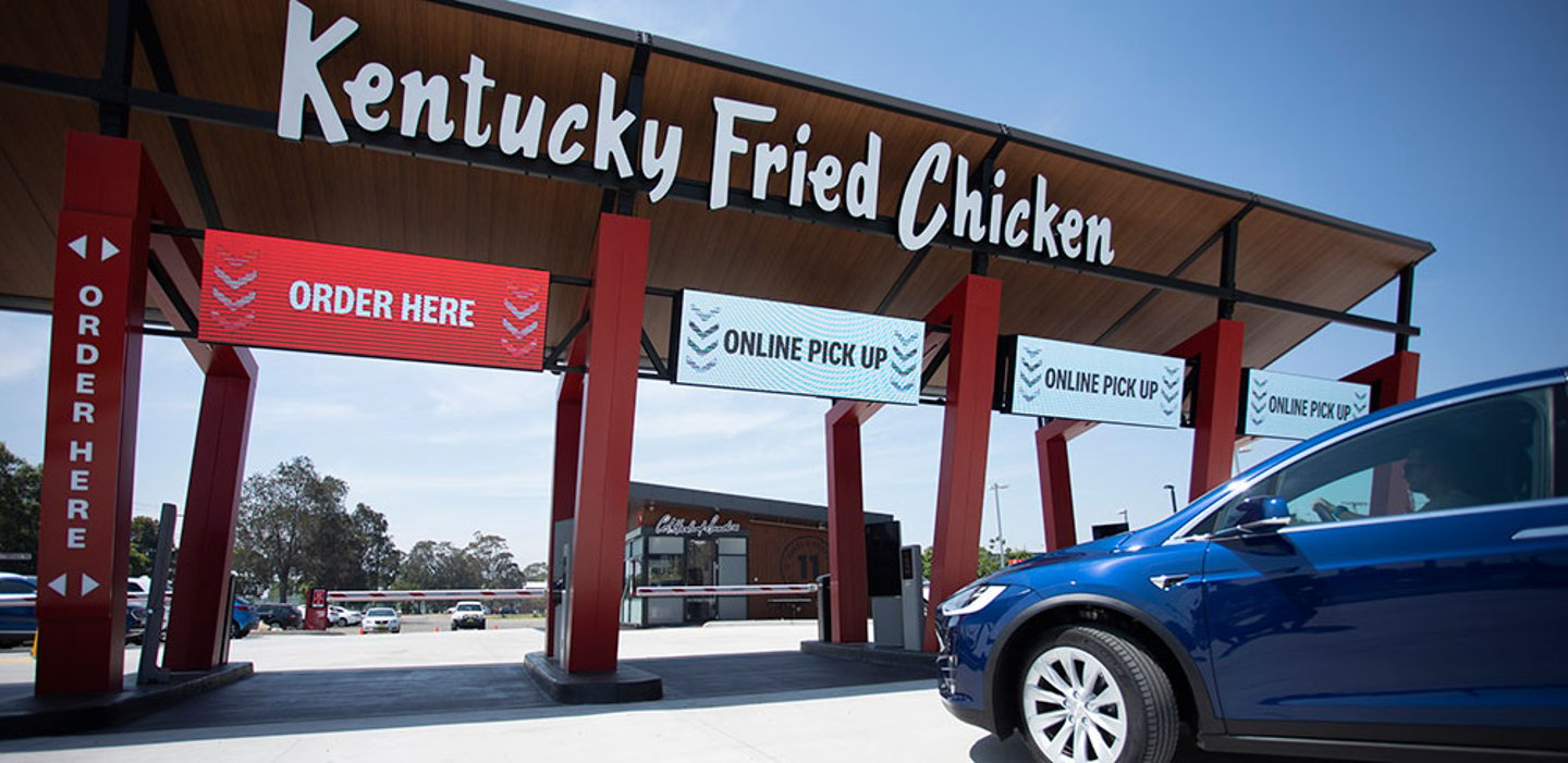
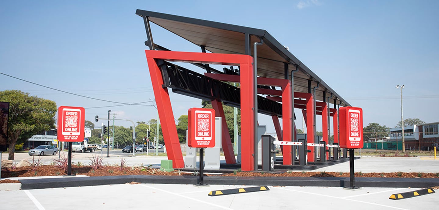
The fast-food giant opened its first drive-thru only restaurant, a pilot in Newcastle, Australia. KFC partnered with FRCH Nelson on the project, which has five drive-thru lanes, including ones dedicated to customers who order and pay through the brand’s app or website along ones for more traditional, on-the-spot orders.
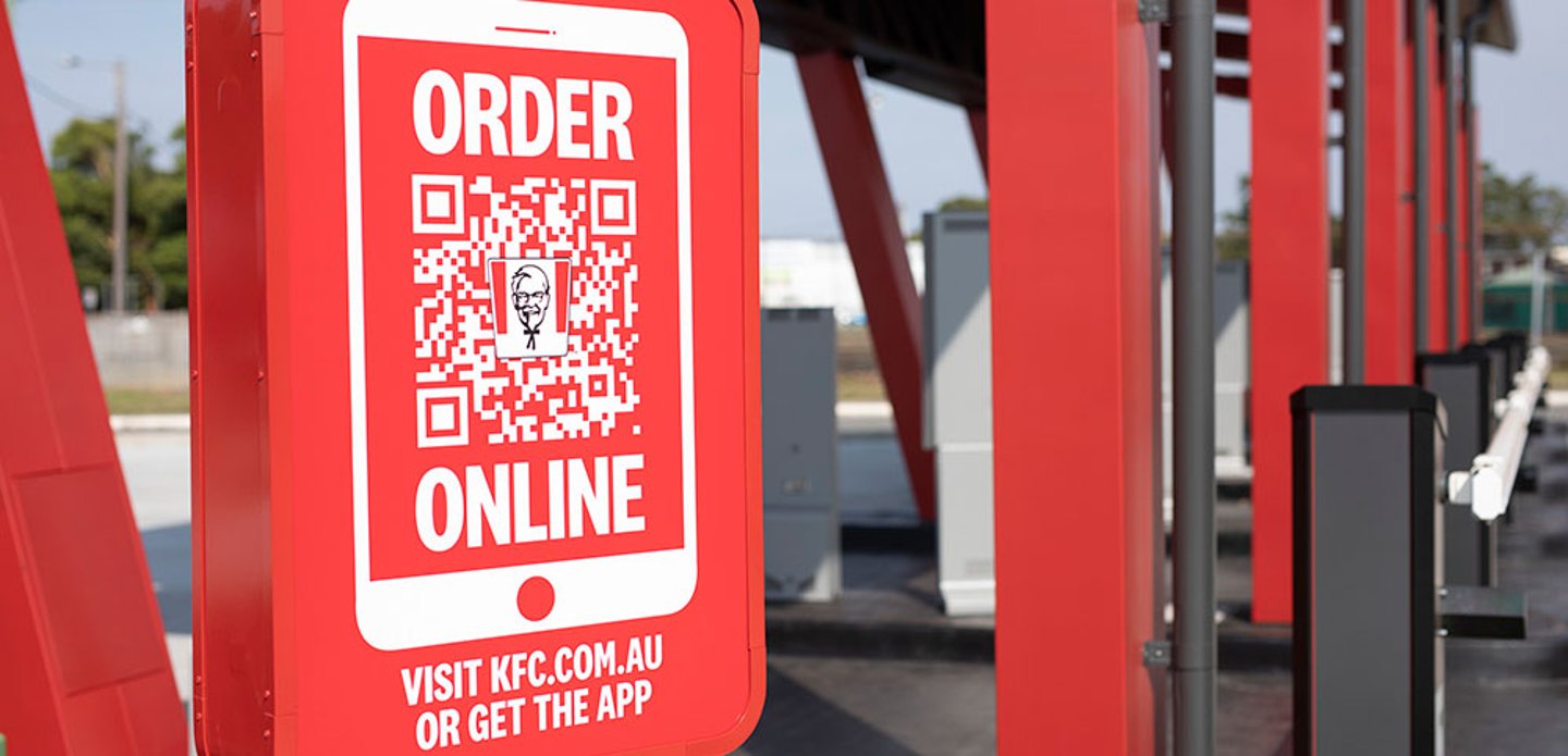
For online orders, customers can drive up and enter a four-digit code, generated by the app, on a touchscreen, which will then send their order to the kitchen where it is freshly prepared and ready for collection
Not having a public-facing interior, FRCH Nelson team looked for key opportunities to celebrate the brand on the building’s exterior.
“With traditional restaurants, the building is the experience, but with this new concept it became a fixture – one element supporting the overall experience,” said Marty McCauley, design director at FRCH Nelson. “We had to utilize every exterior touchpoint from the landscaping, to the signage, to the architecture of the drive-thru portal, to create a holistic experience for guests.”
The goal of the new design was to create a holistic drive-thru experience, leveraging architecture, communication, service and landscape to create an elevated guest experience.
Guests are first greeted by a larger-than-life halo-lit Colonel Sanders layered atop the building’s wood cladded walls, complete with Kentucky Fried Chicken lit branding on the wall. Once guests pull around they are met with the drive-thru portal where architecture creates a true beacon for the experience.
“The portal architecture was an opportunity to create an ownable element for the brand. We needed a bold moment that dialed up the scale since the entire guest journey is taking place within a car,” said McCauley.”
The overall design reflects the brand’s signature hospitality, while still offering moments of the Colonel’s feistiness, leveraging natural materials in conjunction with steel and glazing. The architectural elements exude the brand’s confidence in delivering an unforgettable guest experience. The end result is a branded celebration that leverages contrast and vibrancy through architecture, color, and communication to proclaim a distinctly kinetic, ownable bastion of service and convenience.


