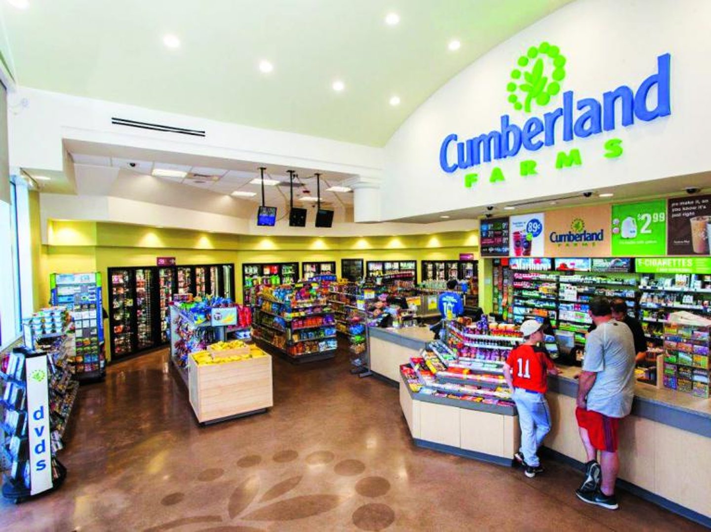
Reimagining Cumberland Farms
Cumberland Farms, a convenience store fixture in New England and central Florida for half a century, once fielded more than 1,000 stores. But, it has slimmed down to 600 locations as it transforms itself from a strip-center and gas station dairy store to a chain of freestanding, modern C-stores providing an array of food service options and gasoline.
Fran Sheflin, Cumberland Farms’ director of planning and construction, recounted the family-owned chain’s decade-long journey of rebranding, reimaging and remodeling during the SPECS session, “Cumberland Farms: Rebrand, Reimage, Remodel.”
The company’s revamp process started in 2007 with an appeal from Cumberland Farms CEO Ari Haseotes to The Moseley Group, a Franklin, Mass.-based retail, food and beverage consultant. The company has helped recast the public faces of brands the likes of Circle K, Au Bon Pain and Carl’s Junior.
In 1957, Haseotes’ parents opened the first Cumberland Farms location, in Bellingham, Mass., as a way to directly market products from their dairy farm in nearby Cumberland, R.I. Storefronts evolved to gas station formats, and the business escalated with the company’s 1986 purchase of Gulf Oil. As time went on, the Haseotes family recognized new trends, including a customer-service-orientation, in the C-store industry. It wanted to take part, so it reached out to Moseley.
Moseley polled consumers and found that Cumberland Farms had lost its original connection with customers as a local, family-owned farm store. Customers also wanted to see more choice and innovation in the stores’ food service offerings, and more fresh prepared foods.
In response, a new mission statement was crafted and new leadership was put in place, with new store designs and products to follow. The company engaged the services of architectural and design firm HFA — by chance located in the same Franklin office park as Moseley — and the store transformation was underway.
A new concept store was created, one that celebrated the company’s farm heritage with an updated identity and decor package, and new made-to-order food offerings. Other features included a more stylish and modern design, with wider aisles and digital signage.
Larger, more open space was devoted to food service inside the store, which was crafted in two varieties — sleek boxes for urban areas and colonial-style buildings for suburban locations.
HFA architect James Owens said that Haseotes insisted on using the colonial-themed stores in Florida as well as up north to give the chain a point of difference in the Sunshine state.
“He said he wanted the stores to look like they dropped in out of the sky from New England,” Owens explained.
A white, green and blue palette was chosen for Cumberland Farm’s new branding, with brand imagery created for everything from drink cups to gas pumps. The Haseotes accepted all the changes. But they insisted that the company’s blue and white logo — with its iconic tree symbol — had to remain intact.
Not only had it become instantly synonymous with the brand through the decades, but it also held a lot of meaning for the Greek immigrant family who founded the chain. The tree that sprouts from the logo was the Greek “tree of life,” with a shade of blue that came directly from the Greek flag.
But the logo also brought to mind the image of the old Cumberland Farms. The family was finally won over to a newer version that featured a more organic representation of the tree. The iconic tree symbol is now green, and calls to mind a sprout with leaves encircled by a ring of dots. The Greek blue still shows up, in the word “Cumberland,” while the word “Farms” is green.
Between 2009 and 2013, Cumberland Farms opened 28 new stores and remodeled 141 locations in the new style. Since then, the company has completed 34 remodels and 105 new builds.

